PORTFOLIO
BROCHURE DESIGN
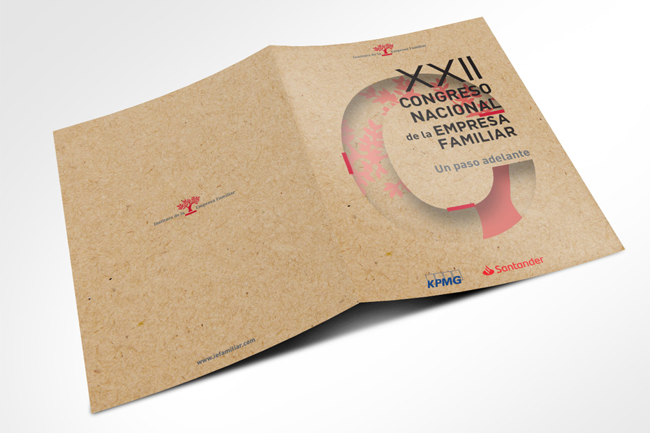
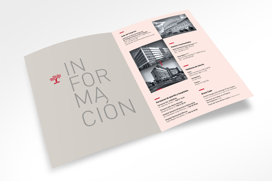
Layout of the program of the XXII National Congress of Family Businesses 2019. The brochure is composed by the agenda, the program, the CV of the speakers, a space for notes and information of interest.
Creative direction by EFS.
In collaboration with Estudi Ferran Sendra, Barcelona
BROCHURE DESIGN
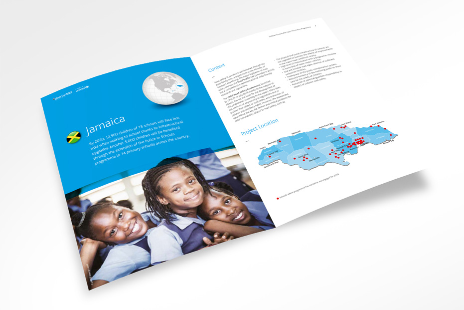
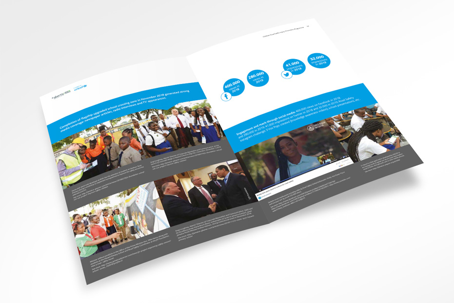
Monitoring Report for Abertis. The brochure gather valuable learnings about the practical application of the UNICEF Road Safety Initiative whose ultimate goal is that children can walk, play and learn safely in the cities where they live.
Creative direction by EFS.
In collaboration with Estudi Ferran Sendra, Barcelona
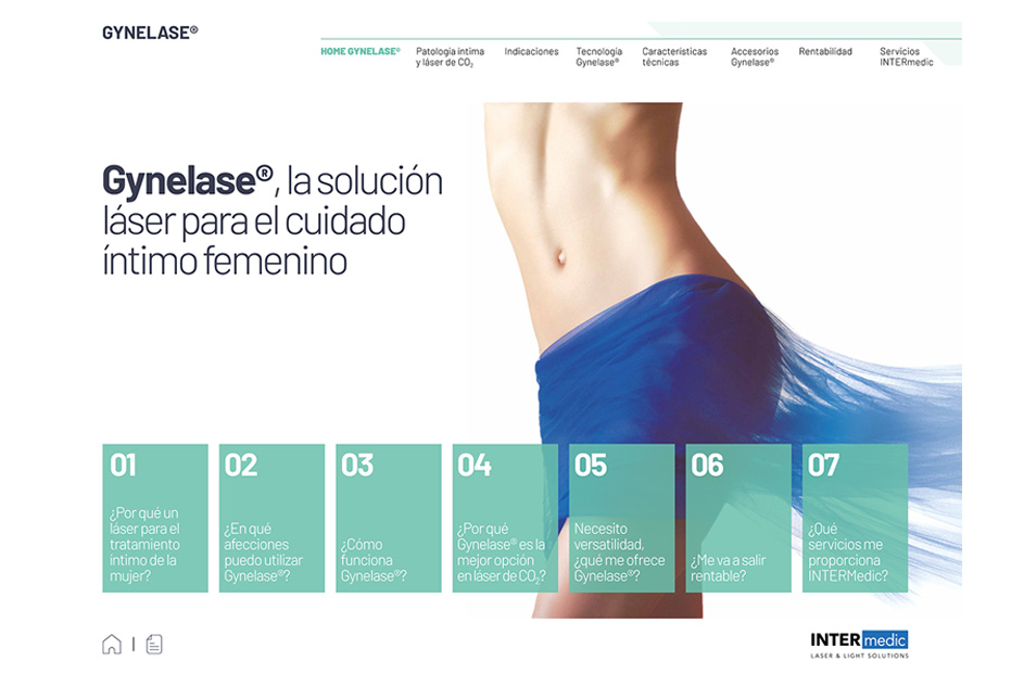
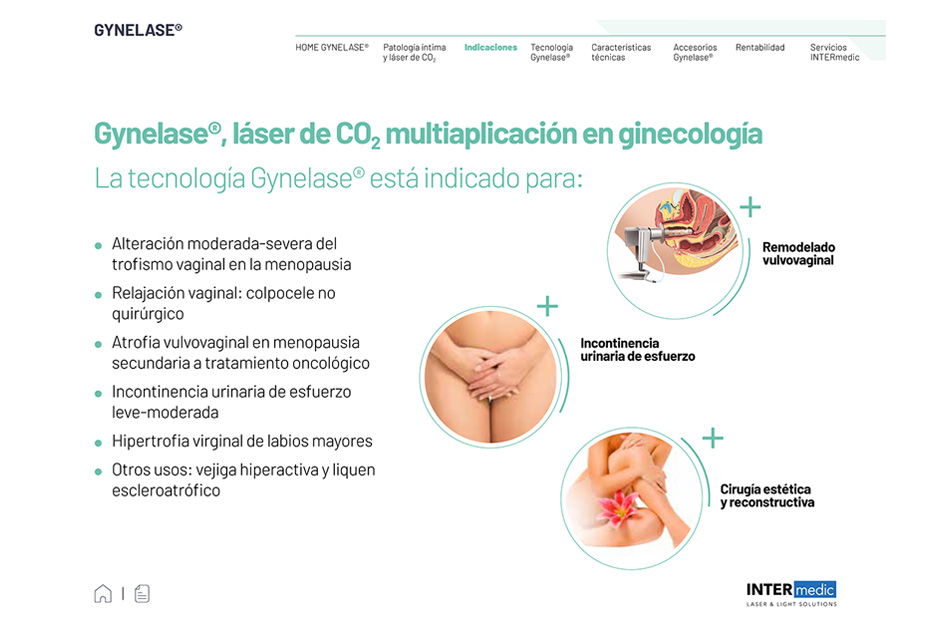
DIGITAL BROCHURE DESIGN
Informative brochure on medical technology, to present a new laser solution for the well-being of female health.
Creative direction by Friday Monkeys.
In collaboration with Friday Monkeys, Barcelona
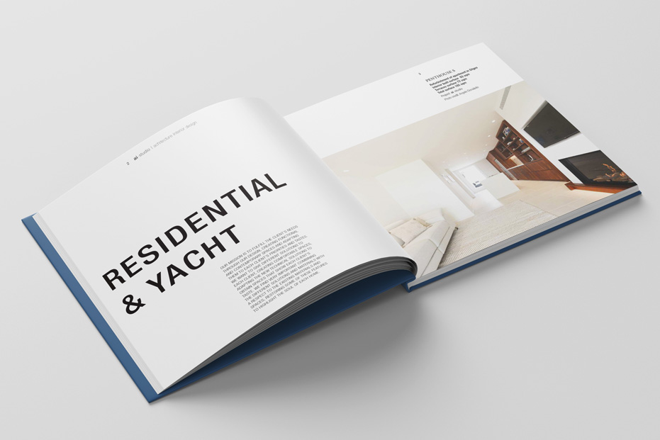
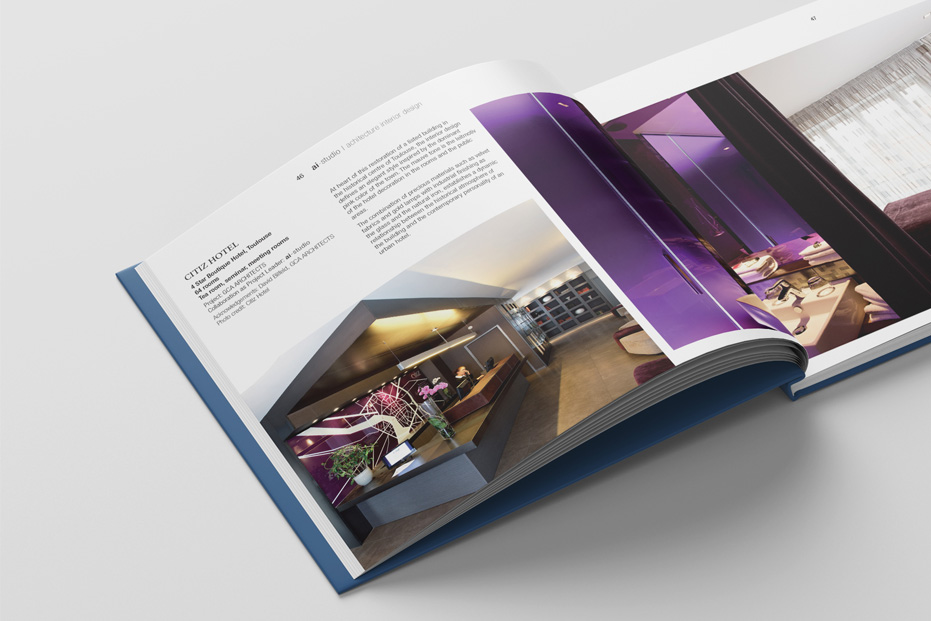
CORPORATE IDENTITY & BROCHURE DESIGN
Design of the corporate brochure for Barcelona-based architecture and interior design studio that stands out for the quality, functionality, sustainability, detailed approach and technical resolution of the projects.
52 pages.
Client: ai-studio arquitectura e interiorismo
CORPORATE IDENTITY
Typographic logo formed by the initials of the singer. It generates a balanced visual game of positive and negative space between the two letters that merge with each other. It confers elegance and balance. It is enigmatic and delicate but full-bodied.
Client: Enivia Muré, Mexico
CORPORATE IDENTITY & PACKAGING
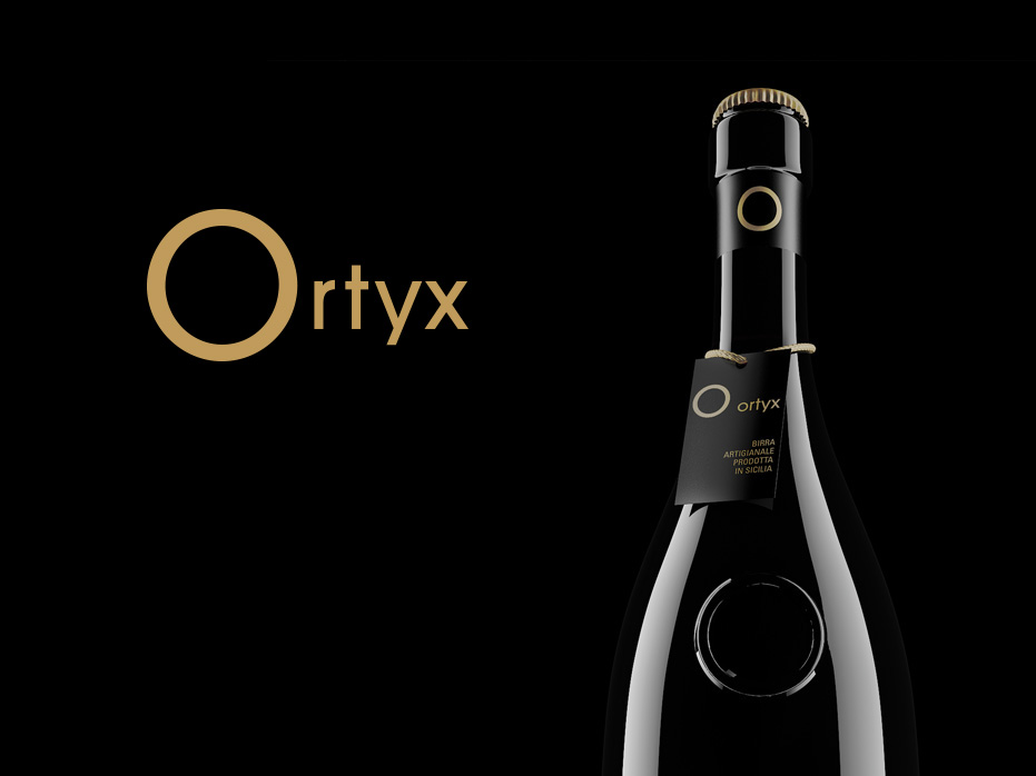
Corporate identity for Ortyx, a brand of craft beer produced in Sicily, Italy. The symbol is a golden circle, simple, dynamic, easy to remember, warm, elegant, distinguished and timeless in shape. It reflects the perfection of the taste of beer and the warmth of the Sicilian sun. It is also the initial letter of the name that allows us to play with its shape in different ways.
Client: Imprint Soc. Coop, Italy
CORPORATE IDENTITY
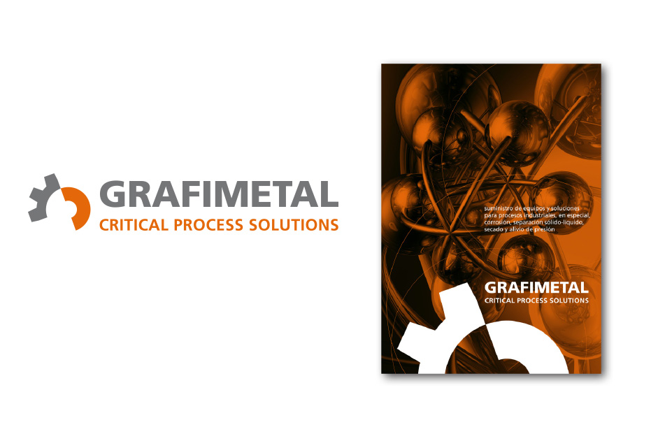
Logo made up of elements associated with industry, mechanics and metal. It generates a visual game of circular and dynamic positive and negative shapes. The typography is solid and very legible, it represents the solidity and stability of the company. A metallic grey combined with a warm orange is used as the colour of the molten metal that brings the logo to life.
Client: Grafimetal, Barcelona
DIGITAL MAGAZINE
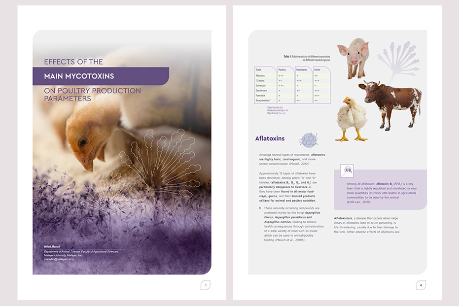
Mycotoxinsite Magazine on-line technical articles.
Creative direction by Agrinews.
In collaboration with Agrinews, Barcelona
MAGAZINE
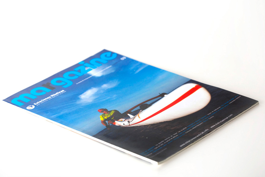
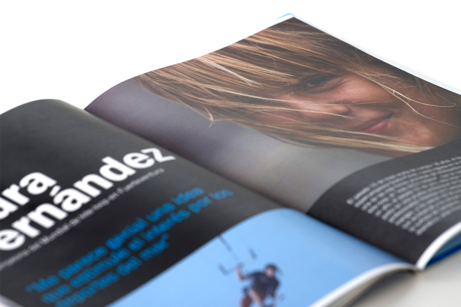
Magazine "Margazine" of the Spanish Association of Nautical Stations. The aim of the magazine is to promote tourism and water sports through information, photographs and colour.
Creative direction by EFS.
In collaboration with Estudi Ferran Sendra, Barcelona
EXHIBITION PANELS
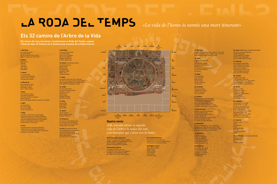
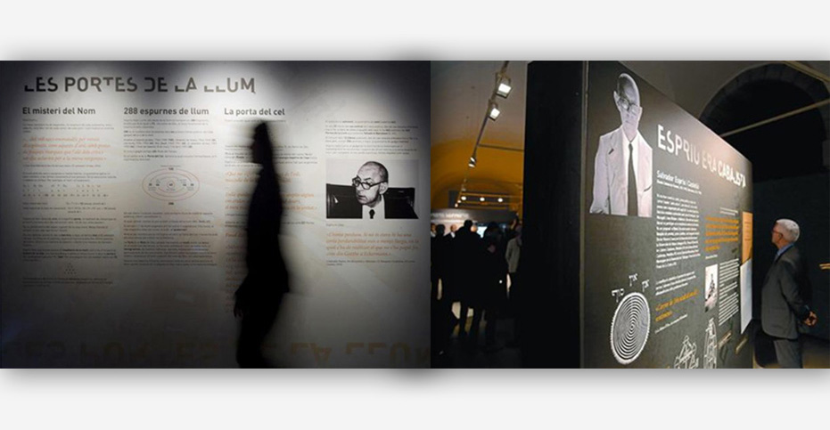
Design and layout of the panels for the exhibition La Càbala i Espriu. The exhibition has been made as a tribute to the poet and shows the relationship between Hebrew mysticism and his work. The panels show a transition playing with colour and a strong symbology.
Creative direction by EFS.
In collaboration with Estudi Ferran Sendra, Barcelona
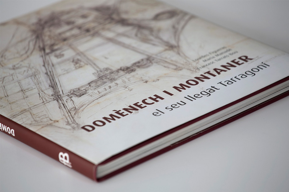
BOOK DESIGN
Design of an architecture and archaeology book. It shows unpublished manuscript works of the architect, his passion for previous civilizations and the presence of his architectural creativity.
160 pages.
Client: ForBook, Barcelona
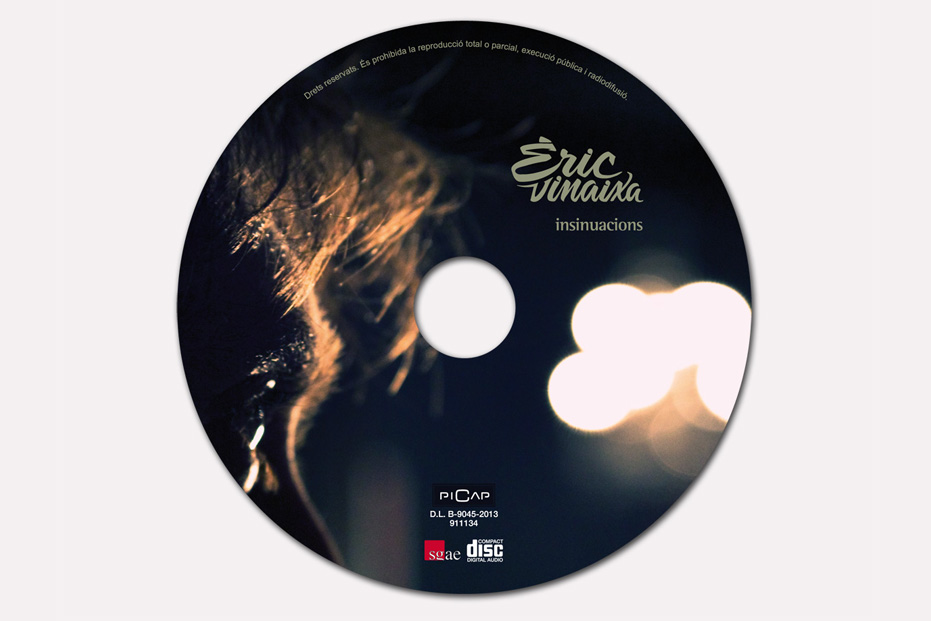
CD DESIGN
CD insinuacions by Èric Vinaixa.
The design strengthens the intimacy, sensuality, mystery, calm, reflection, existential nostalgia and slight provocation that the album hides. The photographs insinuate objects, light games, blurs...
Client: Record company Picap, Barcelona
